
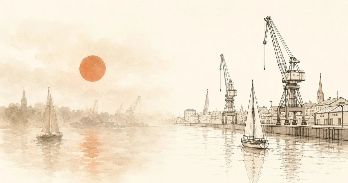
Le Havre, 1872. Claude Monet stands at the window of his hotel room and paints the sunrise over the harbour. What ends up on the canvas is a scandal: blurred cranes, a diffuse orange in the haze, a few shapes that might be boats. A critic sneers that the painting is not even finished, a mere “impression”. The name sticks: “Impression, soleil levant” gives impressionism its name.
There is an entertaining theory about why Monet painted the way he did. He was, or so the story goes, short-sighted. The painting does not show the harbour as it was. It shows it as Monet saw it.
And with that, Monet had, viewed through today’s glasses 😉, a classic data pipeline problem.
Claude Monet’s broken pipeline
Monet’s “business process” was painting. His input: the reality outside the window. His sensors: his eyes. His output: the painting. Between reality and canvas, then, sat a processing chain, a pipeline of the kind data engineering builds in every company today. And somewhere in it there was a defect: the raw data arrived blurred, noisy and colour-shifted. Monet made the best of it: art history, after all.
Whether Monet really was short-sighted is disputed, mind you. Something else is well documented: in old age he developed cataracts. Over the years his paintings turned redder because his lens filtered out more and more blue, until he had surgery in 1923 and was horrified to discover what he had been painting. He painted over or destroyed several of his late works.
That is gradual sensor degradation without monitoring. The fault did not appear overnight but in small steps, and nobody raised an alarm. Every data engineer gets goosebumps here.
That is exactly how it happens in companies: no system fails with a bang. A field gets repurposed, an interface quietly changes its format, a report has been running on outdated costs for months, and nobody raises an alarm. Poor data quality does not feel poor. It feels normal.
Why this should concern you as a decision-maker
The point is not that Monet needed a data engineer. It sits in a thought experiment: Monet was, after all, painting France’s second-largest trading port. What if he had been a merchant? His competitors read the panorama on the way in like a dashboard: which ships are at the quay, who is unloading which cargo, where the customers are. Only Monet would have had to search laboriously for what everyone else already knew. In art, blurriness makes you famous. In trade, it makes you poor.
Which is exactly why:
Data is your company’s sensory system.
Just as Monet’s eyes sat between the harbour and the canvas, your data sits between reality and decision. Market, customers, competitors, your own processes: you perceive none of it directly, only what reports, dashboards and spreadsheets pass through to you.
And AI does not make that sensory system redundant; it makes it more critical. It sees exclusively what gets passed to it, just faster and at greater scale. A sharpened sensory system is multiplied by it. So, unfortunately, is a blurred one. Data quality is thus no longer an IT metric but the limit of what your AI can see at all.
Plenty of companies thus paint their own “Impression, soleil levant”, every month anew. A few symptoms you might recognise: sales has different revenue figures from controlling, and the monthly meeting debates which number is right, instead of which decision follows. Nobody knows the margin per project precisely, because the calculation and the actual costs live in different systems. And the question “how did Q2 actually go?” gets three different truths from three departments.
The ERP knows the order. The CRM knows the customer. The ticket system knows the trouble. Nobody knows the whole story. It sits scattered across data silos that nobody in-house has ever called by that name. Companies do not lose data. They lose context.
That is the harbour of Le Havre in the morning mist. It looks like a picture of reality. It is an impression.
The dangerous thing about blurred perception: it feels sharp
For a long time Monet did not know that he saw the world differently from other people. That is precisely what makes perception problems so treacherous, in people and in companies alike. Nobody decides “on a hunch” on purpose: after all, you have numbers and reports.
Only by comparison do you notice the difference, in a market unfortunately through the competitor: the one who spots demand earlier, adjusts prices faster, sees bottlenecks coming. They see the same harbour — just in focus. And with AI that gap is widening dramatically: give an AI blurred data and you get confidently phrased blur back.
What a data and AI strategy has to do with it
A data and AI strategy is not a 200-page document and not a technology shopping list. At its core it is a pair of glasses. It answers three questions:
What do we want to see? Which decisions, processes and business models should get better through data and AI, and which opportunities are sitting in the fog today?
How sharply do we need to see? Not every company needs real-time vision on everything. Sometimes a reliable, shared monthly view is enough, but then it really has to be reliable.
What do we focus with? Which capabilities, which platform, which data governance does it take to turn scattered raw data, through clean data integration, into one version of the truth instead of five impressions of it? Because a dataset without lineage is like a painting without provenance.
The good part: unlike Monet’s case, the correction is not a risky operation. You simply have to start looking where sharper vision is worth money immediately.
What to take away from Le Havre
Monet’s story ends on a conciliatory note. After his eye surgery he saw blue again and, at over eighty, created some of his greatest works. His sensory system was sharpened, and the output changed immediately.
For art, the blurriness was a gift. For your company it is not. The uncomfortable question is this: how do you know that you see the harbour clearly? Monet was certain. Everyone feels certain.
The most honest first step is therefore not buying a tool but taking an eye test: one structured look at where your company sees clearly, where it mistakes impressions for facts, and what potential is hiding behind that. Formats like a Data & AI Potentials Workshop exist for exactly that: half a day in which business and leadership perspectives jointly map where sharper vision makes the biggest difference.
Monet turned his pipeline problem into an artistic revolution. Respect for that. But be honest: in your quarterly report, you do not want impressionism.
Which leaves one question for your next monthly meeting: which decision are you making right now on the basis of a story that is only half told?
Why this post comes first
A personal note to close: this is the very first post on this blog, and the story from Le Havre does not open it by accident. Sharpening a company’s senses is exactly what drives me: the moment when five impressions become one shared view and a company sees clearly, for the first time, what potential sits in its data. That motivation is why this blog exists.
And that is how it will continue: the next posts follow the data and AI journey. How does an idea cloud become a solid proof of value? Why do AI projects so often fail on the business side? And what does a data and AI strategy have to do with your margin? No buzzwords, no tool lists, just one recurring question: where does sharper vision make the biggest difference? Stay tuned, the harbour gets clearer with every post.