
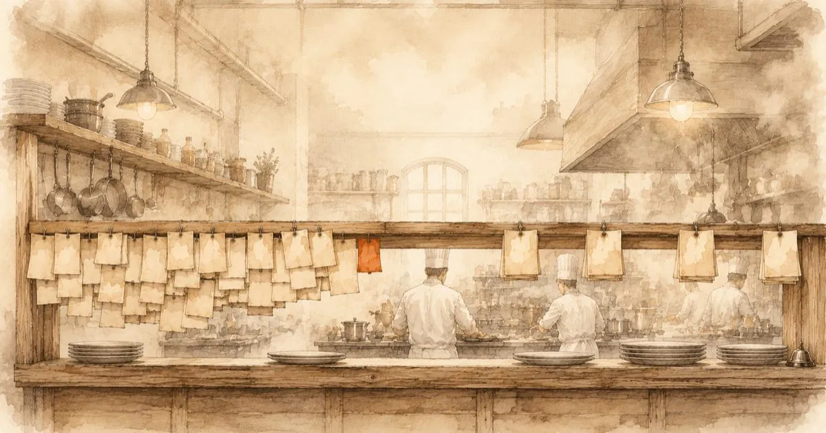
There is a moment I experience in almost every Data & AI workshop. After two hours, thirty or forty use case ideas are hanging on the wall, from integrated corporate reporting to supply chain forecasts to a live view of stock levels. The mood is excellent. And then someone asks the question that can flip that mood: “Lovely. So what do we start with?”
That question is where it is decided whether an energetic workshop turns into a data and AI journey — or into a photo album of sticky notes. Today I want to show you how an idea cloud becomes a sorted map: via a potential map and via clusters to streams that carry your entire portfolio. The kitchen has a word for this: mise en place, everything in its place before the cooking starts.
Step 1: locate every idea on the potential map
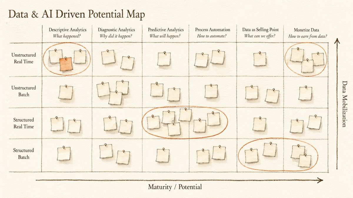
The first mistake to avoid: treating use cases as a flat list. A list can only be voted on item by item, and then whoever was loudest wins. A list, after all, answers only one question: who wins? The better question is: what belongs together? And that one is answered by a map with two axes, the potential map.
In kitchen terms: the menu is the business side, it determines what you want to serve your guests, in other words your potentials and use cases. The kitchen with its cooks and equipment supplies the enablers, the people side and the technology side. A menu full of desserts without a pâtissier is a promise without a kitchen; an expensive oven without a dish that needs it is technology without a mission. Business leads, people and technology enable: the two have to be brought together from the start, and that is exactly what the potential map is the tool for.
The potential map carries the maturity of the potential on one axis, from descriptive analytics (“what happened?”) through diagnostic (“why did it happen?”), predictive (“what will happen?”), process automation (“how do we automate the process?”, these days mostly a job for agentic AI) and data as selling point (“what can we offer thanks to our data?”) to monetising data (“how do we earn money with our data?”). On the other axis, data mobilisation: does the use case need structured data from ERP and CRM, or unstructured documents, images, emails? And is the overnight batch run enough, or does it have to be real time?
Why the effort? Because of one unremarkable but powerful property of this map: use cases that sit in the same region of the map share their implementation prerequisites. Two dashboards on structured ERP data need the same data connections, the same master data, the same platform base. A live stock level and a machine utilisation case share the same event connection. The map makes visible what the list hides: synergies.
Step 2: thirty ideas become four themes
Now comes the actual magic trick, and it is astonishingly simple: you look at the populated map and draw circles around neighbourhoods.
Every professional kitchen shows how powerful this principle is, and it owes it to one man: around 1900, Auguste Escoffier organised the kitchens of the Savoy and the Ritz on the model of his time as an army cook. Before him, every cook prepared whole dishes on his own; Escoffier broke the work down into stations. Ever since, a restaurant with forty dishes on the menu does not cook forty separate projects: the saucier runs meat and sauces, the entremetier the sides, the pâtissier the desserts. Each station bundles equipment, techniques and mise en place that every dish in its neighbourhood shares.
Those stations are exactly what you are looking for on your map, because they show which enablers your menu actually demands. In practice, a handful of natural clusters almost always crystallise out, for example:
Analysis & diagnosis: all the reporting and controlling cases on structured data, such as corporate reporting, sales performance and procurement dashboards. Common denominator: an integrated, reliable data basis across system boundaries.
Forecasting & potential analysis: forecasting, customer value scoring, supply chain predictions. Builds on the first cluster. Common denominator: the same integrated data basis, plus predictive analytics capability, in other words building models, training them and monitoring them in daily operations.
Real-time transparency: live stock levels, machine utilisation, early warnings from the supply chain. Common denominator: connecting events in real time instead of waiting for the overnight batch run.
Data as a product: curated reports for the dealer network, benchmarks for customers, a data API for partners. Common denominator: data products with stable interfaces and quality you can stand behind.
Thirty competing individual ideas have become four strategic themes. That changes the discussion fundamentally: instead of “which use case wins?”, you ask “which capability do we build first, and which use cases does it unlock?”
Two honest caveats belong here. First: the circles follow the shared prerequisites, not the org chart. Anyone who draws every department its own cluster has merely repainted the list. Second: a circle on the map is not yet a station in the kitchen. The shared prerequisite has been found, not built: the first integrated data basis remains a solid piece of work.
Step 3: from clusters to streams
Each cluster now becomes a use case stream: a workstream with one concrete first use case, a clear focus and named stakeholders. And here is the decisive idea I want to press on you: a stream does not only deliver its first use case. A stream opens up a capability that enables every follow-up use case in the same cluster.
In the kitchen this goes without saying: once the pâtissier station is in place, the next dessert on the menu costs almost nothing. It inherits the oven, the craft and the well-rehearsed routine. Nobody would think of building a separate bakery for every new dessert.
When the “analysis & diagnosis” stream builds the first integrated dashboards, it creates along the way the data connections, the master data logic and the governance that every later analysis benefits from. When the real-time stream connects the first live stock levels, it creates the event connection that every further real-time case gets almost for free. Which is why it pays to distribute streams deliberately across the potential map: each one opens up a different region, and together they span the foundation for the entire portfolio.
The whole thing in one sentence
If I had to summarise the path from a wall full of sticky notes to this point: collect, locate, cluster and translate into streams that build up more than their first use case. Or in kitchen terms: set up stations instead of cooking dishes one by one.
The idea cloud, by the way, is never the problem. It is the raw material. The problem is leaving it unsorted, because then chance decides what you start with. And in my experience, chance has a poor track record with business cases.
Which leaves two open questions: which stream starts first, and what does the very first step look like? Short answer: prioritise in a way that commits, and start with a proof of value, not a proof of concept. The long answer gets a post of its own.
In the kitchen, this moment has a name: the mise en place is done. Time to light the stove.